Consolas Font: Paying it forward
Last month at the Detroit Area Fox User Group, my friend Paul Mrozowski demoed a number of tools and tips he uses every day in his VFP and .NET development. It was a great presentation and one where I learned a number of new things. One of these tips is to use the Consolas font from Microsoft.
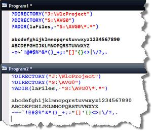
The Consolas font is a non-proportional font like Courier New, but is better in many respects. The first is it is heavier or thicker than the Courier New font, but it is narrower too. In my opinion it is easier to read and provides more text in the same space. Other big differences are number zero (is it the letter O or the numeric zero?), the possible semi-colon vs. colon confusion, and the comma vs. period. Here is an image with both fonts set at 12 point, bold:

You can download the Consolas Font Pack for Microsoft Visual Studio 2005 direct from Microsoft. It works with Visual FoxPro too ;).
I like to work with smaller fonts and work at a high resolution (1920x1200) on a 15.4 inch wide screen monitor running Clear Type. I believe the eye strain I experience working long hours is reduced.
Thanks Paul for this simple, but fantastic tip!


3 Comments:
The install will not run unless you have Visual Studio 2005 installed already!
Oh well - good idea!
Well that is a bummer. Thanks for letting me know Tim.
I read a post on the Web where a developer was able to install Consolas on a machine without VS 2005 installed. The machine did have the .NET framework installed and the OS was XP SP1. Your mile may vary.
Consolas is also on all versions of Windows Vista.
Post a Comment
<< Home